ShopDreamUp AI ArtDreamUp
Deviation Actions


Description
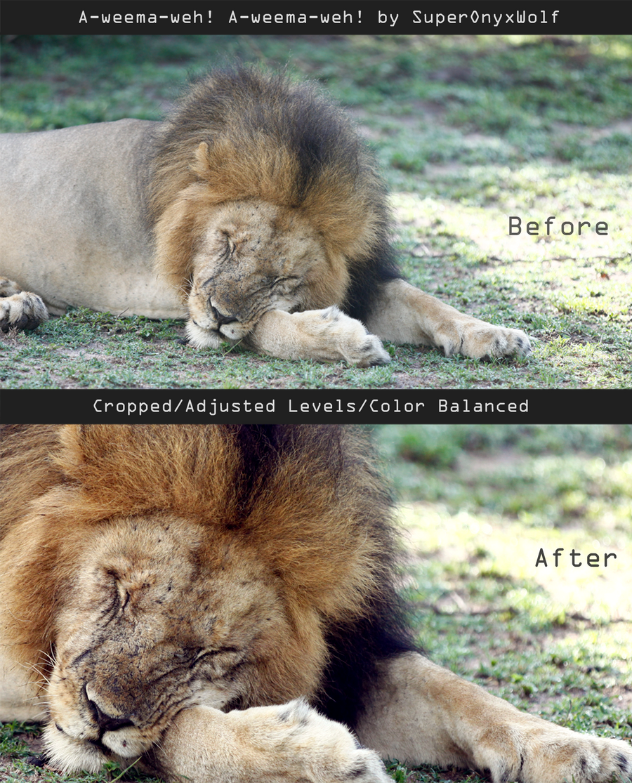
I'm not going to use this one for a full tutorial because I didn't really do anything major to it. I will type out exactly what I did in a huge boring wall of text if anyone wants to read it:
Before I explain anything let me just say that I'm not an expert, and this isn't me saying what everyone should do for everything! Everything explained here is what I taught myself to do after trial and error. It isn't for every photographer and it definitely doesn't work for every photograph!
(I use Adobe Photoshop CS5 btw)
Alright, so first I have to pick out my crop. The original picture is too zoomed out, and I want to get close and personal with this fuzzy dude. Getting close helps to bring out the detail and the facial expression. Look at his eye/nose wrinkles in the "before" picture versus the "after" picture; you probably notice them better after the crop. I also like to use the rule of thirds in most of my crops. (Basically you make sure the subject is not smack-dab in the middle of your photo and it's usually more interesting) The subject is his face area so I position that to the left. (His arm also adds kind of a line that leads your eye to his face but that's getting a little too complex for this description so I'm going to leave it with the simple "face is on the left")
Next I adjust the levels. There's no great way to explain how to do this for each photo but I can tell you what I did on this one. The original photo is a little washed out (it was partially cloudy/misty when the photo was taken and Mr. Fluffy here was also in the shade of a bush) To fix this we adjust the levels to add contrast to the darker areas. (you can also use the "Brightness/Contrast" adjustment to fix this but I like to use levels whenever possible, just a personal preference) I'm probably going to upload a full sized tutorial that explains what I do for this eventually...
Finally the color balance! I also can't really explain this too well but I'll do my best. Color Balance is a handy Layer Adjustment in Photoshop that people tend to forget about. Basically it allows you to adjust the colors for the Shadows Midtones and Highlights of an image. For this image, I added elements of blue and magenta to the shadows to give them a cooler essence. The highlights were made to appear more yellow. The midtones got red, green and yellow. (I usually mess with the midtones last because I like to use them to balance the changes made in shadows and highlights)
Sorry about my awkward explanation paragraphs (I probably confused anyone reading)

If you have any questions ask me in the comments!
Wow that was more than I wanted to write. If only I could wright English assignments with that much enthusiasm...
I also have no idea what category this goes in...
Before I explain anything let me just say that I'm not an expert, and this isn't me saying what everyone should do for everything! Everything explained here is what I taught myself to do after trial and error. It isn't for every photographer and it definitely doesn't work for every photograph!
(I use Adobe Photoshop CS5 btw)
Alright, so first I have to pick out my crop. The original picture is too zoomed out, and I want to get close and personal with this fuzzy dude. Getting close helps to bring out the detail and the facial expression. Look at his eye/nose wrinkles in the "before" picture versus the "after" picture; you probably notice them better after the crop. I also like to use the rule of thirds in most of my crops. (Basically you make sure the subject is not smack-dab in the middle of your photo and it's usually more interesting) The subject is his face area so I position that to the left. (His arm also adds kind of a line that leads your eye to his face but that's getting a little too complex for this description so I'm going to leave it with the simple "face is on the left")
Next I adjust the levels. There's no great way to explain how to do this for each photo but I can tell you what I did on this one. The original photo is a little washed out (it was partially cloudy/misty when the photo was taken and Mr. Fluffy here was also in the shade of a bush) To fix this we adjust the levels to add contrast to the darker areas. (you can also use the "Brightness/Contrast" adjustment to fix this but I like to use levels whenever possible, just a personal preference) I'm probably going to upload a full sized tutorial that explains what I do for this eventually...
Finally the color balance! I also can't really explain this too well but I'll do my best. Color Balance is a handy Layer Adjustment in Photoshop that people tend to forget about. Basically it allows you to adjust the colors for the Shadows Midtones and Highlights of an image. For this image, I added elements of blue and magenta to the shadows to give them a cooler essence. The highlights were made to appear more yellow. The midtones got red, green and yellow. (I usually mess with the midtones last because I like to use them to balance the changes made in shadows and highlights)
Sorry about my awkward explanation paragraphs (I probably confused anyone reading)
If you have any questions ask me in the comments!
Wow that was more than I wanted to write. If only I could wright English assignments with that much enthusiasm...
I also have no idea what category this goes in...
Image size
1600x1981px 4.92 MB
© 2013 - 2024 OnyxHavok
Comments0
Join the community to add your comment. Already a deviant? Log In